In our research for the 4th edition of the Intranet Usability Guidelines report, we studied 15 intranets at organizations around the world. The new report volumes contain 800 intranet screenshots and over 300 guidelines based on cumulative findings from usability testing 57 intranets over 18 years with over 285 employees.
This article summarizes the study methodology and a few findings across each topic. Review the new reports that are available now to learn more.
On this page:
Effective Content Requires Intranet Ownership and Oversight
One of the biggest insights from this study was that some form of intranet-content oversight, whether through a centralized or hybrid content-management model, is needed to ensure high-quality content and to preserve the findability of information in both the intranet’s navigation and search.
Many organizations we studied shared concrete examples of how they thoughtfully planned their intranet content to consider employee and organizational needs. They identified who would manage information and collaboratively decided its location and intended duration on the intranet.
Teams also shared examples of how they maintained content by regularly checking for its relevance, effectiveness, and accuracy and by adjusting content as needed to uphold standards. When content becomes outdated, it’s updated, consolidated, or removed.

Centralized Content-Management Model Is Most Efficient
Intranets adopt one of 3 content-management models:
- Centralized model: A single team (or a very small number of teams) owns the production, management, and publication of content on the intranet. Five of the organizations we studied followed a centralized content-management model.
- Distributed model: Content production is democratized, and ownership, production, management, and publication of content are spread across the organization. Five of the organizations we studied followed a distributed content-management model.
- Hybrid model: Some content is owned by a central team, while other content ownership is distributed. Four of the organizations we studied followed hybrid content-management models.
It took employees less time to complete tasks on intranets following a centralized model (average 78 seconds) compared to those following a distributed model (average 123 seconds). This difference was statistically significant (p < 0.001). Intranets following a hybrid model had significantly shorter task times than distributed models (average 84 seconds versus 123 seconds, p < 0.001). The difference in task times between centralized and hybrid models was not significant (p >0.05).
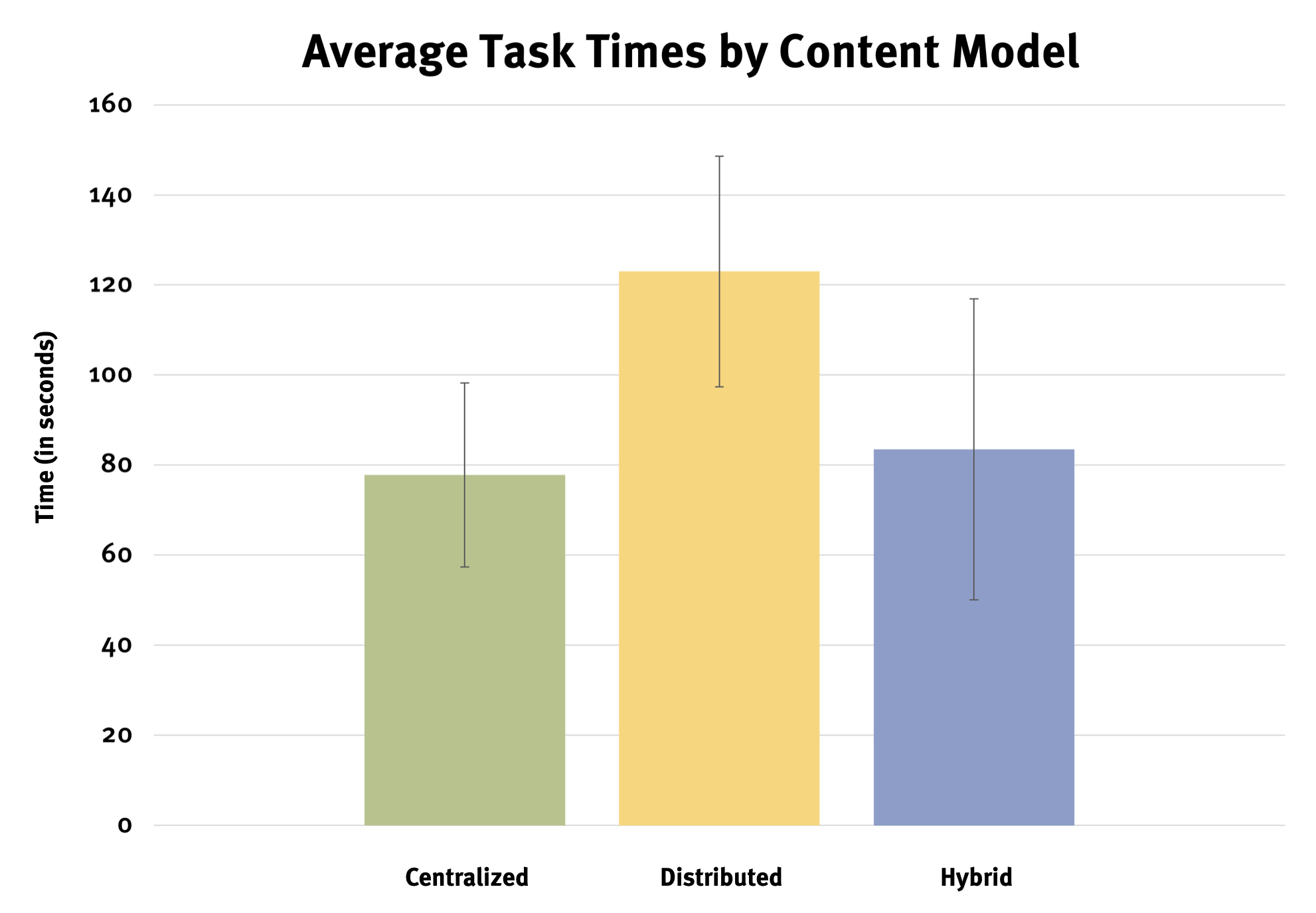
This finding suggests that having some central management of intranet content is best for helping employees efficiently find the information they need — likely because thoughtfully managed, formatted, and structured intranet content helped employees find information more efficiently.
For example, on The Northern Alberta Institute of Technology’s intranet, employees could quickly scan each headline on the transit-discounts page to understand the copy underneath. A bulleted list of eligibility criteria outlining how to get a discounted transit pass helped employees avoid dense paragraphs of copy to understand what to do to qualify.

You can find examples of how organizations outlined content standards in their intranet design systems in the detailed reports. These examples show that intranets with content standards had better-quality information and led to higher employee satisfaction.
Clarity and Task Specificity for Intranet Information Architecture
Organizing information by department makes it difficult to find. Thankfully, according to our recent research, this trend is declining.
When intranet content was organized based on employees’ everyday tasks, frequently accessed information and tools (such as news, people information, apps, forms, and policies) could be found quickly.
Intranet teams should construct their information architecture and navigation based on:
- The tasks that employees perform on the intranet
- The terms they use to describe those tasks
The team at the Scottish Government performed user research to understand its employees’ top tasks and used that understanding to structure the information architecture. The intranet team also performed card sorting and tree testing to ensure that links had clear labels and that users could find content easily in the navigation. Their team lead said, “We had to shift our mindset from functions to user needs.”
As a result of these efforts, the Scottish Government’s intranet ranked in the top three (out of 15) intranets for the highest task-completion rates and lowest task times.

Clear, task-supporting navigation labels across intranets included:
- News: News and articles from the past year
- Benefits, pay, and time: Access to information about work and life benefits, payroll, and time off
- People, teams, and departments: Information about people, groups, departments, and reporting structures
- Employee profiles: Spaces for each employee with a profile photo and contact information
- Apps and tools: Tools for IT help, maintenance requests, resources for travel, managing computers and phones, and expense reporting
- Career growth, learning, and training: Upcoming training and career-growth resources
- Projects or Products: What the organization offers and what’s currently happening
- Glossary: Frequently used words, acronyms, and jargon
- About [the organization]: Information about the organization, such as history, values, policies and procedures, management, and office locations
Avoid including vague category labels in the intranet navigation; employees struggled to find information they needed when they encountered nonspecific navigation labels such as:
- Resources: What type of resources? Resources for whom?
- Productivity: What counts as a productivity tool, and what doesn’t?
- Support: What kind of support? Support for what?
- Community: What type of community? Community around what?
In the report, we highlight several other examples of effective intranet navigation structures and labels, along with facets and filters.
For example, Bracknell Forest Council used faceted navigation on the Groups area of its intranet. This approach helped employees explore different types of employee-run groups based on the group’s purpose (e.g., educational or social) or other qualities they were looking for. Intranet content managers must accurately and consistently tag content for faceted navigation and filters to work effectively.

Including Quick Links in intranet navigation was another common approach, but that label is not descriptive. Employees used this feature more when it was labeled My Saved Links or My Favorites and contained links saved by the employee. Popular Links or Top Links was a good label for links grouped automatically based on usage.
A Single Search Field Supports High Expectations for Results
A single search field that indexes content, people, and tools from one central place on the intranet is the most optimal, user-friendly approach. It also aligns with employees’ expectations, as set by mainstream search engines. When multiple search fields existed, employees slowed down to locate the correct one.
An exposed search field in the upper right corner of the intranet keeps search available and efficient. The word Search or a magnifier-glass icon worked best as labels for the search button next to the search field.

Many employees used search as the starting point for tasks during usability tests. When discussing the intranet’s search experience, one employee said, “Usually, the quickest way to find something on the intranet is to search. The search bar is really good. It’s always right there for me when I need it, every time.”
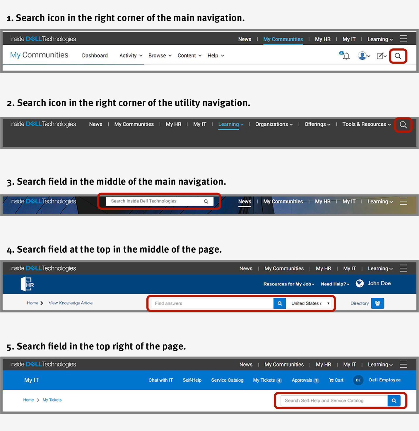
On Dell’s intranet, InsideDELLTechnologies, the search field appeared in five places. Sometimes, it was an open text field in the middle of the header; in other cases, it moved into the dropdown navigation or to the right side of the header. When the search moved, users questioned whether it was an entirely new search bar and where the other one went. It also made people ask whether they were still searching the entire intranet or only a scoped section when the search field moved.
Interaction Issues with Type-Ahead Suggestions
A common issue with type-ahead search suggestions was that, as users hit Enter to execute their search, they would accidentally trigger a search for the first suggestion listed instead of the keywords typed in the search box. Unfortunately, the first suggestion wasn’t always relevant to the user’s needs. This is why it’s essential to let users freely choose the suggestion that best matches their intent rather than selecting one by default.
Employees also lost patience while waiting for search suggestions to load and clicked on the Search button to speed up the process. When they did so, the search results displayed a No Results page, and users wondered why the search didn’t work. The issue was that clicking on the magnifying-glass icon while the type-ahead search suggestions were loading triggered a new search on an empty search field instead of searching for the original keywords the employee had entered.
When type-ahead search suggestions appeared automatically and were relevant, users clicked on a suggestion and sometimes even bypassed the search-results page entirely — if the suggestion was a search result that took them straight to the desired page. We observed a favorable example of this functionality on Atrium Health’s intranet. Users could pick from a suggested term or go straight to a suggested page directly related to their search.

Expanding Results Panels Versus Results Pages
A new trend we observed was the use of a collapsible results panel that appeared on one side of the screen instead of a search-results page. This approach was problematic because users questioned whether the results were only for the current section or the entire intranet. Users also couldn’t interact with the content on the background page because the modal overlay covered it.
Additionally, if a user clicks on a link and then goes back to the search results, it’s unclear if the collapsible panel will reappear or if they’ll be taken to the previous page they were on before searching. This search-results format was also difficult for employees to interact with on mobile devices due to the limited screen space available to display the collapsible panel.
For example, at Eyeo, a user questioned whether she was searching only on the current page or if she was searching on the entire site. She asked, “Is the search all over the intranet or just the page that I’m actually on?”
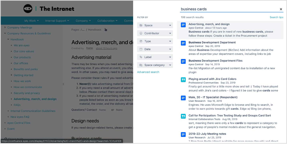
We recommend displaying search results on a regular page instead of in a collapsible panel that expands from the side of the screen.
A poor search experience has a negative impact, as many users will give up and ask a colleague for help instead. When the intranet’s search results were repeatedly irrelevant, users resorted to saving pages, emails, and bookmarks to avoid searching. A few employees throughout our study described the habits they had created:
“I think in my department, most people end up bookmarking things because it’s easier than going to search.”
“I still don’t like using the intranet to find stuff. I probably have 50 to 60 bookmarks, and I don’t want to try to find things again. I would probably bookmark that page I was on, so I could find it again.”
“For me, I’m kind of lazy, and I have things bookmarked, and I have Workday bookmarked, and I use it constantly.”
“A lot of times, I already have things saved, like the emails for Ethics and Compliance . . . 99% of the time when I’m doing those learnings. I’ve received an email, and I already know it’s there.”
“That’s why I’m so dependent on the things I’ve saved. It takes too long to find it under someone else’s definition that doesn’t meet my definition.”
These behaviors suggest that having some way to save essential links and information on the intranet, in addition to an effective search, can help employees quickly access what they need.
Consistency and Basic Design Practices Still Often Overlooked
We observed the following improvements related to intranet visual design and branding:
- Wider use of responsive design
- Creation and use of design systems and style guides
- Grid-based layouts
- The use of white space to break up content and images
- Some attempts at consistency across digital workplace tools
Despite these positive trends, many teams still have opportunities to improve their intranet’s branding and visual design by:
- Using larger fonts and better text contrast to support scannability
- Avoiding autorotating carousels
- Adding labels to all icons
- Not overlaying text on images
- Making links look like links
- Left-aligning buttons in web forms
- Creating consistency in the visual design of the intranet and other digital workplace tools
Rather than using a consistent design system, pattern library, or set of page templates to establish a common visual language and page structure, on many intranets, different sections had a different look and feel. When pages looked different, employees felt disoriented or questioned whether they were still on the intranet and how to get back.
Lack of consistency across intranet areas meant lost productivity, as employees had to consider whether they were in the right place before starting an activity and needed to spend time figuring out how content was structured. One employee said, “The intranet should feel more like a set of cohesive and related web pages . . . If you make it more user-friendly, you wouldn’t have to navigate through all these different pages.”
The Scottish Government housed its design standards on SaltireGuidelines.com. This site was accessible, easy to understand, and included content guidelines. The use of the design system was evident on the intranet, as page design was clean and consistent.
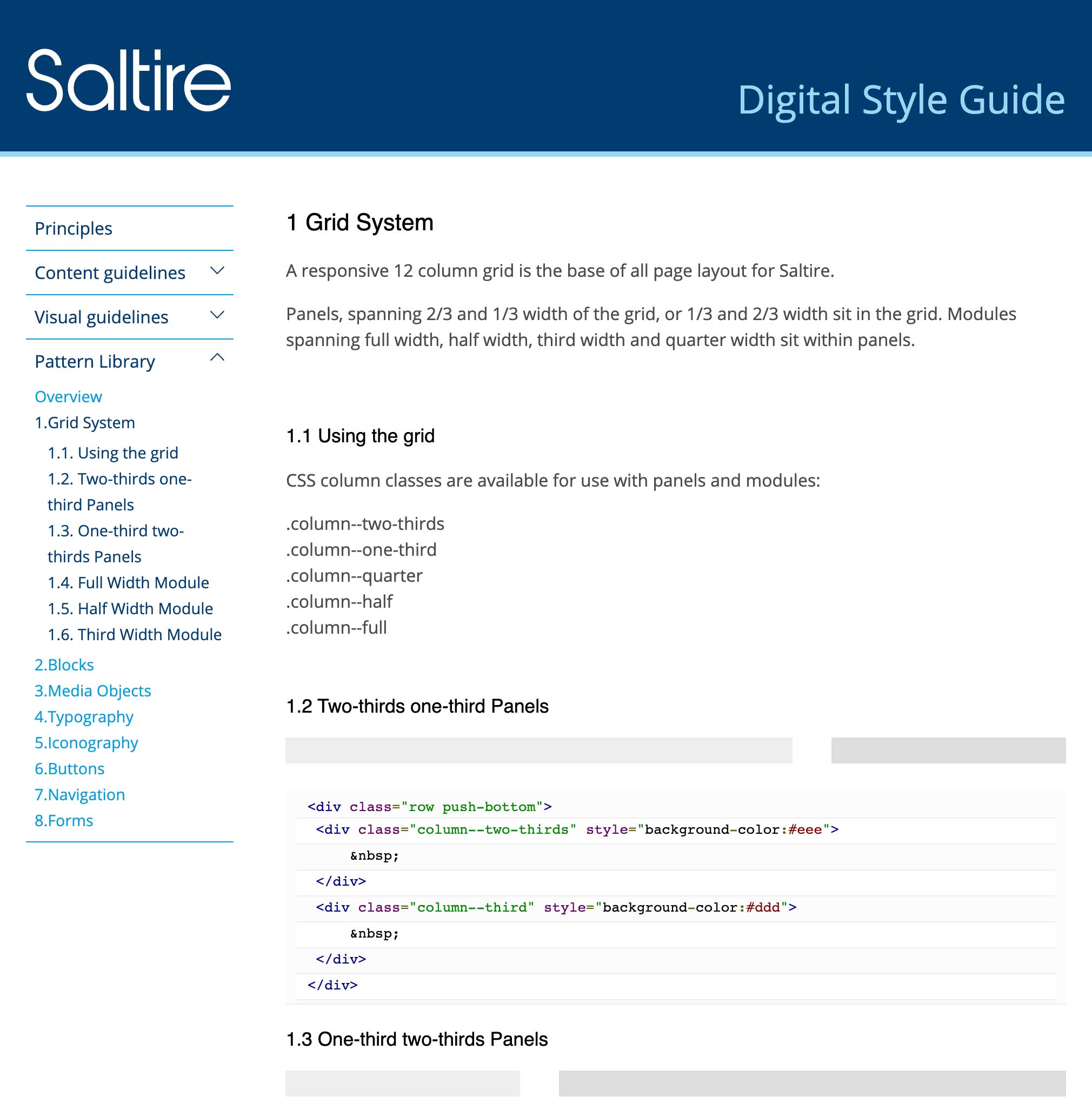
Solving the problem of an inconsistent intranet requires more than a design system, uniform page templates, and purposeful components. You can’t simply hand off a set of design-system components and then walk away, expecting the intranet to stay visually uniform and consistent over time.
Ongoing training and accountability for content managers and publishers — the people who build pages and post content to the intranet — are also necessary. These individuals must know when and how to use the right components, text treatments, and visual styles and be responsible for following specific design standards. Training and accountability also ensure that content managers avoid problematic behaviors cause inconsistent-looking pages, such as freely editing the HTML and CSS.
About the Report and Our Research
By focusing on real-world usability studies and diverse organizational needs, the 4th edition of NN/g’s Intranet Usability Guidelines report provide a roadmap for enhancing intranet design and functionality, and for creating a productive organizational environment.
Report Volumes and Guidelines in the 4th Edition
The 4th edition comprises four volumes:
Each report provides detailed insights and evidence from our intranet research studies. Findings are organized into five types of guidelines that serve as practical tools for creating engaging intranets:
- Design guidelines: Actionable advice substantiated by behavioral evidence, employee feedback, discussions, and screenshots
- Definitions, principles, and methods: Relevant definitions for terms, principles, and research methods we suggest using in your own intranet-design work
- Process and strategic considerations: Large-scale initiatives and process ideas that enable employee-centered intranet design
- Timeless design tips: Design practices that have remained relevant across decades of intranet research and design evolution
- User behaviors: Descriptions of how employees acted as they used the intranet (If you’re not doing much of your own usability research with employees, refer to these behaviors as a best guess for how your employees may act in similar scenarios.)
Intranet-Research Goals and Methodology
We’ve conducted intranet usability studies since 2002 to learn about:
- How employees use intranets
- What makes intranets helpful or unhelpful
- What to do to make intranets better
We used the same study procedure in each of the four rounds of research. The procedure included three usability methods:
- Usability testing[RB1] [AK2] in a lab or conference room, with researchers watching employees for 75–120 minutes as they attempted 9–15 realistic tasks on the intranet. Employees used company or work computers; some also used their mobile phones. Most of the tasks had specific criteria for success, while a few were used to measure engagement and had no success criteria.
- Field studies where a researcher watched employees work for 1–5 hours to see how and when they used the intranet in their work or to manage content.
- Expert reviews during which researchers analyzed the design considering users, top tasks, and established design principles.
Intranets Studied in the 4th Edition
We selected various intranets (custom-built, commercial off-the-shelf, different technology stacks, etc.) and organizations (industry types, sizes, countries) to ensure that practitioners can apply our findings to many situations and intranet types.
Organizations in the study ranged from small companies to large enterprises across the United States, Canada, and Europe:
- Atrium Health (Charlotte, North Carolina) (Healthcare)
- Bracknell Forest Council (London, UK) (Government)
- Burns & McDonnell (Kansas City, MO) (Engineering)
- City of Calgary (Alberta, Canada) (Government)
- Co-operators (Guelph, Ontario) (Insurance)
- DELL (Round Rock, Texas) (Technology)
- DIRTT (Calgary, Canada) (Construction)
- eyeo GmbH (Cologne, Germany) (Technology)
- First Solar (Perrysburg, OH) (Energy)
- General Services Administration (Washington DC) (Government)
- KeyBank (Cleveland, OH) (Financial)
- Mayo Clinic (Rochester, MN) (Healthcare)
- Northern Albert Institute of Technology (Edmonton, Alberta) (Higher Education)
- Royal National Lifeboat Institution (Poole, UK) (Charity/Non-Profit)
- The Scottish Government (Edinburgh, Scotland) (Government)
