Favicons are often overlooked, yet they play a crucial role in brand-building and website creation. These small icons represent your site and provide valuable insights about your brand to web users. They also extend your brand’s visual identity and enhance the user experience.
Despite these benefits, you might still question the value of favicons. They occupy minimal screen space, so why should they be significant? Trust us when we say that the impact of a well-designed favicon goes far beyond its 16×16 dimensions.
In this article, we’ll explore what a favicon is, why it is important, and offer helpful tips on how to create one.
What is a favicon?
A favicon is a small icon that represents a website or brand. It’s typically a 16×16 pixel image displayed next to a web page’s title in browser tabs and search results pages. Favicons are also found in search histories, toolbars, bookmarks, and other online locations.
Favicons help users distinguish between different websites and web pages.
For example, if you have multiple tabs open on your browser, favicons will let you know which website is which. This way, you don’t have to click on each tab to find the site or page you’re looking for.
The icons also help you confirm that the site you’re looking for is the correct one. Say you’re trying to search for Starbucks’ website. If you see Starbucks’ green Siren logo in one of the search results, then you’ll know that it’s the correct site.

Where does a favicon appear?
Favicons appear in several locations across the web. Here are a few of them:
- The search bar
- Search bar recommendations
- Search history
- Browser tabs
- Toolbar apps
- Bookmarks
- Bookmark drop-down menu
What is the difference between a favicon and a logo?
Favicons and logos differ in a few ways. Firstly, favicons are smaller than logos. While the standard size for a favicon is 16×16 pixels, the recommended size for a website logo is 250×150 pixels. Additionally, favicons only appear online while logos can appear both online and offline.
It’s worth noting that companies usually base their favicons on their logos. For example, the McDonald’s website uses a smaller version of the company’s logo as its favicon.

Why are favicons important?
Although some people may dismiss favicons because of their small size, these icons play a major role in your website’s user experience, branding, and credibility.
User experience
Favicons make it easier for users to find and visit your website. Imagine someone views your site and bookmarks it. Later, when that person looks through their bookmarks for your site, they’ll quickly locate it thanks to the favicon appearing next to the site’s name. This saves the user time, helps them make decisions faster, and lets them know they’ve found the right site.
Branding and brand awareness
Using a favicon for your website helps you stand out from countless others. If your website used the same icon as dozens of other sites, people wouldn’t find it memorable.
For instance, if you ran a coffee shop but the favicon for your site was the default gray globe used by millions of other websites, users might overlook or bypass your brand.
However, if you chose a favicon that reflected your brand – maybe even featuring a cup of coffee, if that’s part of your logo – people would remember your site. They might even become more curious about your business, especially if they’re looking for a new coffee haunt!
Credibility
A website that uses a favicon appears more credible than a website that doesn’t. Why? Because a website that doesn’t display an icon comes across as unprofessional or low-quality. Users expect to see a visual representation of your brand or website. If they don’t, they’ll be skeptical of your site and may decide against clicking on it.
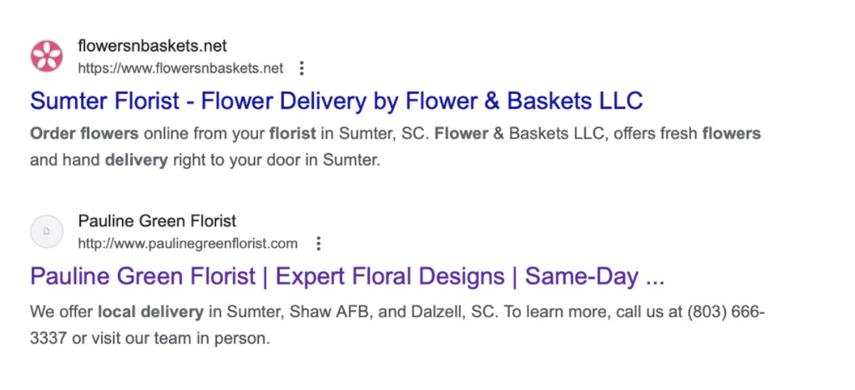
For example, take a look at the search results for florists in South Carolina. The Flowers & Baskets website looks more professional than Pauline Green’s website because it displays a favicon – and a flower-themed one at that! Users would thus be more likely to trust and visit Flowers & Baskets’ site.

How do favicons affect SEO
Although favicons don’t directly affect SEO, they can send strong signals to browsers and users alike, which can organically lead to better site rankings.
Let’s explore how:
1. Favicons help search engines identify your website
Google looks for the favicon file when it crawls a website. It then uses this information to identify your website in its search results and distinguish it from other sites.
Additionally, a well-optimized favicon that is properly linked in HTML signals to search engines that your website is high-quality, which can improve site rankings.
2. Favicons make your website more memorable
A website that uses a custom favicon will attract the attention of users. Although your site will compete with countless others, a clear, unique, and on-brand favicon will make an impression. Your site will enjoy higher clickthrough rates as a result, signaling to Google that your site is valuable to users.
3. Favicons increase the chances of users bookmarking your website
People are more likely to bookmark a page if it has a favicon. This is because the icon provides a visual cue and helps them quickly sift through other pages they’ve saved. Although bookmarking a page may not be a direct ranking factor, it signals positive user engagement, which Google considers when evaluating website quality and relevance.
How to create a favicon in 4 steps
Just because a favicon is small doesn’t mean you should rush through the creation process. With that in mind, consider these 4 steps to design a favicon that is simple but strategic.
1. Determine the design
Before you do anything else, think about the design of your favicon and ensure it captures the spirit of your brand. The easiest way to do this is to use a simplified version of your company logo.
For example, Amazon‘s favicon borrows the first initial and curved arrow (representing the smile of satisfied customers) from its famous logo.

Meanwhile, the favicon for Adidas simply uses the company’s famous three stripes.

Think about your company’s own unique fonts and symbols when conceptualizing your favicon design. Does your logo use bubble letters or a more classic typography? Do you have a distinctive symbol like a beautiful origami bird? Whatever you choose to highlight, make sure your design is consistent with your brand’s identity.
2. Keep it simple
Because favicons are small, you should choose a clear and simple design. Avoid intricate lines, shapes, and other detailed visual elements, as these will be illegible given the restricted dimensions of favicons. Instead, use bold lines, shapes, and shades.
For example, Nike‘s favicon features a single shape (its signature swoop) in white font and places it against a black background. This design choice improves visibility and helps people remember the brand more easily.

Also, remember to use minimal text. To make sure your text appears properly, keep it to one to three characters. Anything beyond that will lead to cut-off letters and a blurry icon, which might discourage users from clicking on your website.
3. Use brand colors
Using your company’s distinctive colors when developing a favicon helps users recognize your brand. Take Tiffany‘s robin’s-egg blue, for instance. When fans of the brand see this color across the world and web, they immediately think of the luxury jewelry brand. Featuring brand colors in your favicon can thus reinforce your brand to users and set it apart from numerous others.


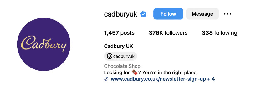
Brand colors also create a consistent visual identity. Cadbury, for example, is known for its rich, royal purple. The brand uses this color for its favicon, website, and social media channels.


But imagine if Cadbury instead used a pink favicon for its site. Users would be confused by this inconsistency. They might even doubt if the website showing in the search results belongs to Cadbury.
4. Choose the proper format and size
When creating a favicon, you need to choose the right format and size. Otherwise, the icon may not render properly or it could fail to show at all.
The most common favicon file formats are ICO, PNG, and SVG.
- ICO is supported by all browsers, including Internet Explorer.
- PNG is supported by most browsers, except Internet Explorer.
- SVG is supported by only a few browsers, including Chrome, Firefox, and Opera.
As for common favicon file sizes in pixels, take a look at the list below:
- 16×16 for Browser favicons
- 32×32 for taskbar shortcut favicons
- 96×96 for desktop shortcut favicons
- 180×180 for Apple touch favicons
- 300×300 for SquareSpace favicons
- 512×512 for WordPress favicons
Make sure to create favicons based on the dimensions appropriate for each platform. When in doubt, opt for a large favicon as it will appear fine even when scaled down. However, small favicons will look blurry when scaled up.
4. Common favicon mistakes
Understanding common favicon mistakes can help you avoid them when creating your own. Here are four pitfalls to keep in mind:
1. Complicated designs
Favicons don’t accommodate elaborate designs because of their small dimensions. Fine lines and detailed shapes may appear blurry – if they appear at all. Excessive text may also be cut off. Since extraneous details can distract from the main message or mission of your brand, keep the design straightforward and use it to convey the most essential idea about your brand.
2. Irrelevant imagery
Using icons that are unrelated to your brand confuses users. For example, say you run a writing blog, but your blog uses a basketball favicon. Users might bypass your website in favor of those that display writing-related favicons like pen, journal, and book icons. To avoid this mistake, clarify your brand identity and use appropriate imagery to reinforce it.
3. Inconsistent branding
An incohesive brand experience is jarring for users. For instance, using favicons that don’t feature your brand colors, symbols, or fonts can leave users scratching their heads. That’s why you should always create a seamless and consistent brand experience. This will not only attract users to your website but also inspire brand loyalty.
4. Poor compatibility
If your favicon fails to display, this will take away from your site’s professionalism. Remember that favicon file formats like PNG and SVG are not supported by all browsers. So, choose your formats carefully. Also, check to see if your favicon translates properly across different devices, including smartphones, tablets, and desktop computers.
How to add a favicon in HTML
After you create a favicon, you need to tell browsers where to locate it. Do this by adding a line of code below the <title> element.
For example, for a PNG file, you’d use the following snippet:
<title> Page Title</title>
<link rel="icon" type="image/png" href="https://www.hongkiat.com/favicon.jpg">
Another option is to create a folder in the root directory labeled “images” and save the favicon in this folder. In this case, you’d enter the following line of code:
<title> Page Title</title>
<link rel="icon" type="image/png" href="https://www.hongkiat.com/images/favicon.jpg">
Afterward, save the HTML file and reload it in your browser. If done properly, the favicon will show to the left of the web page title.
Favicons are more than what meets the eye
Favicons may be tiny, but they make a big impression on web users. You can ensure that this impression is a good one by using our tips to create a simple but impactful icon. So, whether youâÂÂre launching a new website or revamping an old one, let this guide remind you of the power of favicons – and let it put you on a path to better brand awareness and user experience.


