There is a misconception in the UX world that research data speaks for itself and shouldn’t need the addition of a narrative or extra polish to convince others. We often think that by laying out all the facts in front of our teams and stakeholders, they will come to the same conclusions that we did. Unfortunately, that doesn’t always happen.
Telling an interesting story and sharing findings in an engaging way doesn’t have to be the exclusive advantage of live presentations. Whether we share insights from research or sell others on a recommendation, a compelling story can arise interest and get buy-in. When our team members and stakeholders care about users, it’s less of an uphill battle to sell them on our ideas and recommendations.
But how do we communicate a compelling story and keep our audience engaged with a report? Whether the report is a lengthy Word document or a presentation deck, it’s meant to be consumed asynchronously and the author doesn’t have the opportunity to insert a meaningful anecdote to illuminate some of the data like they would in a conversation. This article discusses ideas for how to make your asynchronous research deliverables engaging for your audience.
Using Storytelling in Asynchronous Mediums
If you consistently share research findings in the form of research reports, use the following storytelling techniques to make them engaging to your audience.
Structure Your Report for 3 Audiences
When you share reports with others at your organization, you want to structure them in a way that will cover three different types of reading:
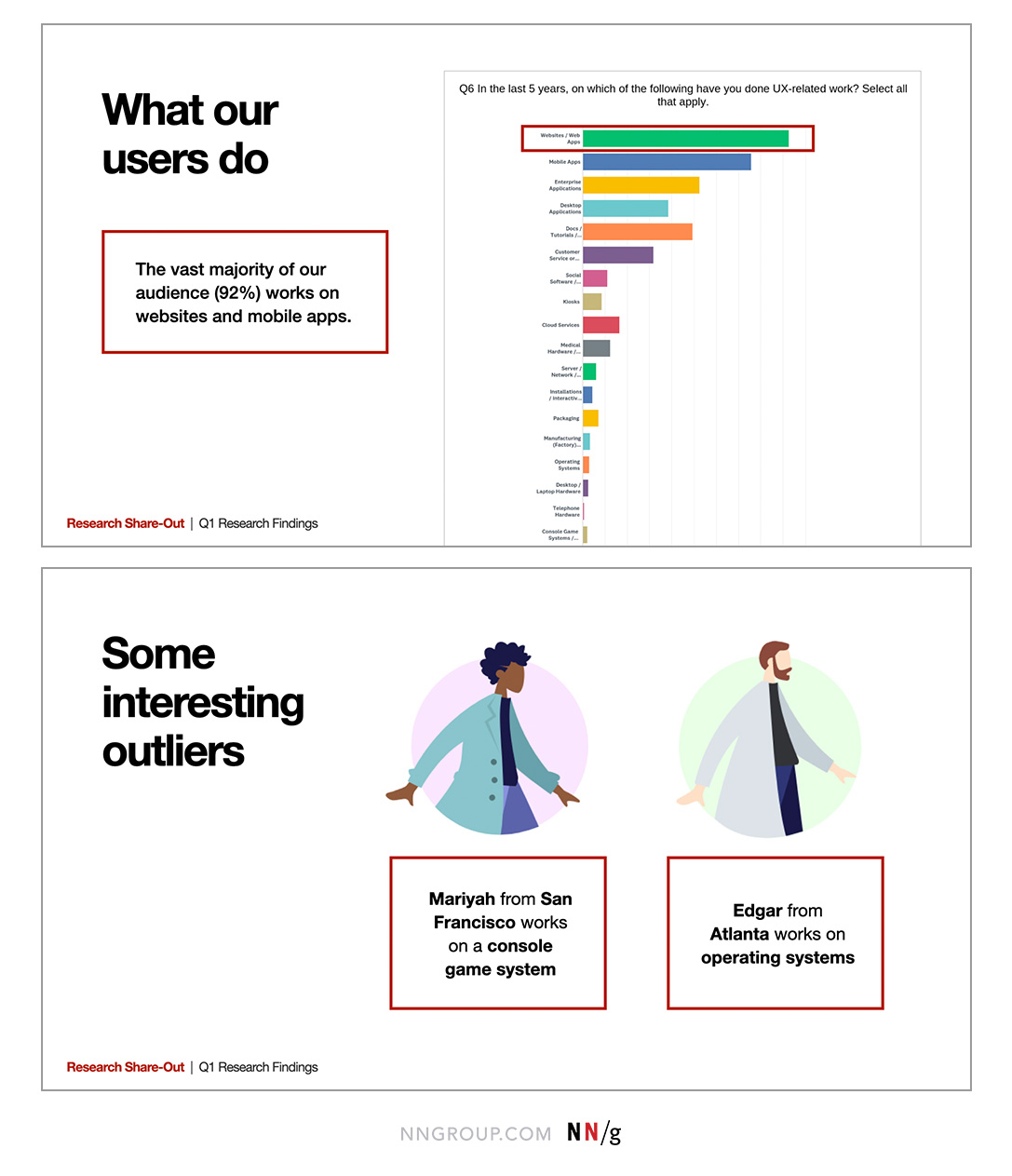
- Just the headlines: The headlines should be aimed towards someone who is likely not involved in the day-to-day inner working of the project, but needs to be kept in the loop to make high-level decisions. If they were to read only the headlines, they should still be able to make sense of the research.
- The big themes: These include the top takeaways, such as strengths and opportunities for improvement, but not the nitty-gritty details of how you got there. Product managers and day-to-day stakeholders may skim the report for these big ideas rather than read all the details.
- In-depth details: Data-driven team members — whether they’re fellow researchers, designers, data scientists, subject-matter experts, or developers — appreciate the details on process and methodology and are more likely to explore the depths of the report.
Use Anecdotes to Persuade
People can depersonalize large numbers and forget that such numbers stand for real people. However, if they only have one person to focus on, they’re more likely to empathize and make decisions with that person in mind. When you want to sell others on your ideas, anecdotes can sometimes persuade more than numbers.
Think about how your data could affect just one person. Anecdotes trigger an emotional reaction and will spark empathy from your audience. This isn’t to say that you should rely only on anecdotes though. Anecdotes can lead to narrative bias, so it’s best to use them to illustrate or support your data.
Find Analogies to Which Your Audience Can Relate
If you don’t have a data-based story about a specific number, you can still help people visualize that number by finding a real-life analogy that people could relate to.
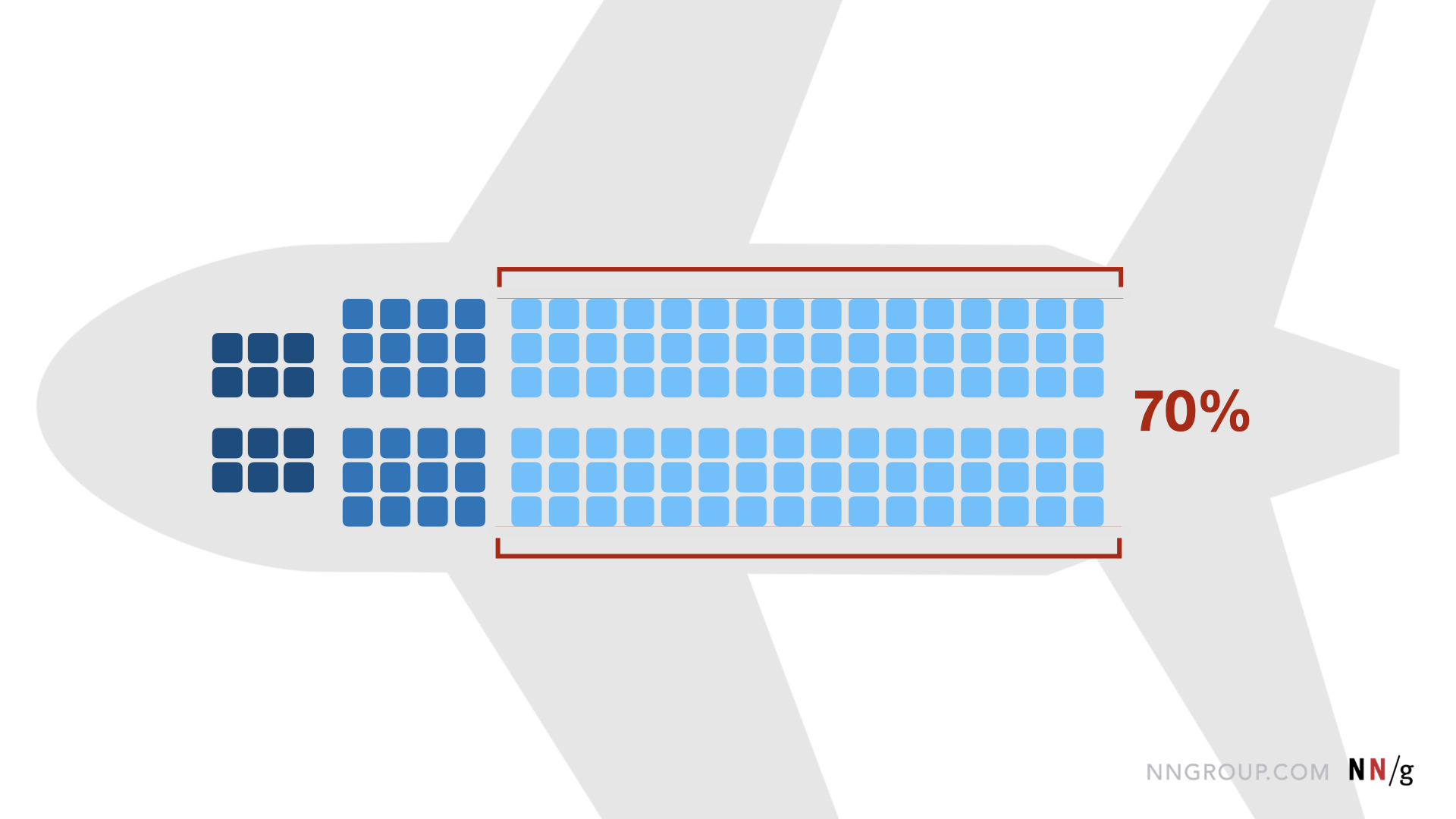
For example, let’s say that your research showed that 70% of customers abandon purchases because of a bad user experience.
That’s a pretty high number, right? Some stakeholders may not perceive how dramatic that number is and it could be worthwhile to make it more tangible and less abstract by providing some context.
Follow these steps to add context to the number:
- Start by introducing a relatable scenario: Imagine a typical 737 airplane with first class, premium economy, and economy seats. You could add relevant numbers (how many seats are in each class, for example), but make sure they don’t overcomplicate the ultimate point you’re trying to make.
- Describe the comparison, analogy, or metaphor: Picture the entire economy class walking off the plane.
- Tie it to your research: That large proportion of people in the economy class is the same as the 70% of customers that are abandoning purchases on our website because of a bad user experience.
Whenever possible, use compelling visuals to quickly convey your scenario instead of relying on lengthy word descriptions.
By making your audience visualize the number with a relatable experience or analogy, you’ll make a bigger impact when you present your metrics.
Break Up Heavy Text-Based Content
Sometimes the easiest way to increase engagement with reports is to go beyond the typical bullet points and text-heavy paragraphs and find some nonstandard way to display your content.
Think about the content you’re presenting and ask yourself the following questions:
- Could this content be a checklist or a bulleted list?
- Are there pros and cons of this recommendation that could be compared side-by-side?
- Is this data better read as a chart or graph?
- Is there a quote or video clip of a user making this point that I could use?
By varying the presentation of your content, you’ll create visual interest in the report and allow readers to take more information in. Varied content is also easily scannable and helps those readers who are prone to skimming.
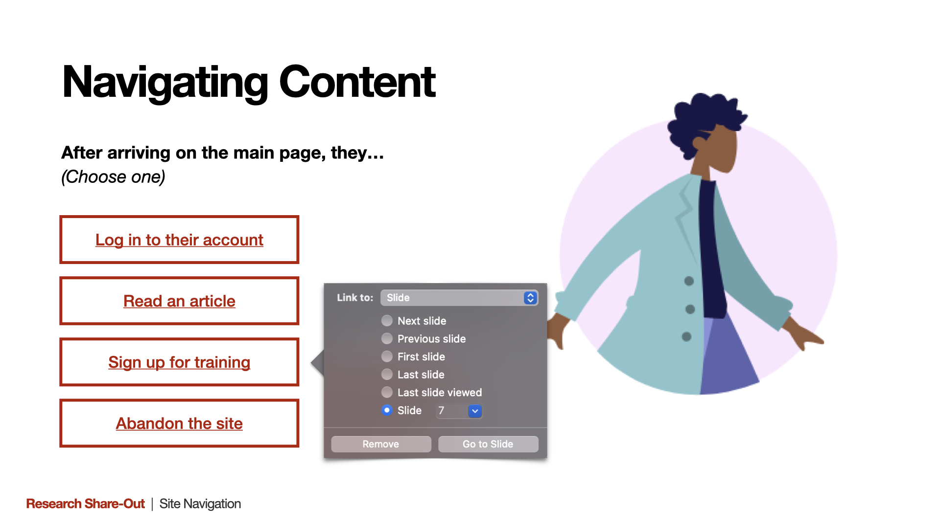
Bonus: Present Material in a Nonlinear Format
Have you ever read a choose-your-own-adventure book? In this type of book, readers get to a point in the story where they must make a decision. That decision will take them in one of two directions in the story. Then readers will have to make more decisions until they get to the conclusion (the butler did it, or maybe it was the old Count).
Creating reports and presentation decks that allow for choose-your-own-adventure stories is a challenge, but can pay off if you have broad research to share with several different teams or areas of the business. This type of deliverable allows you to create one artifact that will serve several audiences.
The key to a good choose-your-own-adventure deliverable is testing the different paths so each delivers value. Walk through the deck on your own and make sure that everything links correctly and maybe even pilot-test your deliverable by sitting with a few different team members to see what they get out of the experience.
Out-of-the-Box Inspiration
Teams should regularly share research insights. For example, a research team may share findings to the larger team from recent research every week or sprint in the form of a UX progress report. This deliverable can be presented live in a meeting or sent out to the team to consume asynchronously.
The downside of having a predictable cadence and template for sharing research is that, after a while, these kinds of documents become stale and less engaging.
Don’t be afraid to change up your presentation methods into something out of the ordinary, such as:
- TikTok style videos: Challenge yourself to present findings in a short-form video. This will require you to sum up your research insights into an elevator pitch. What’s one actionable thing that you want your audience to take on?
- Mini museums: Set up your artifacts and findings in person or in a Miro board and have your audience walk through it at their own pace like they would walk through an exhibit in a museum. Have them post their reactions on sticky notes and then debrief later as a group.
- Video screenings: Put positive and negative video clips from usability testing together (making sure you have proper consent from participants, of course) into a single movie. Encourage your team and stakeholders to hold their own movie screening so they can hear what users have to say firsthand. This can either be done synchronously (with popcorn) or sent out to the team so they can watch on their own.
It’s important to keep in mind the tool that you’re using when sharing research findings. The downside of sharing findings asynchronously is that you won’t be there to see how people react and to help if things go wrong. Avoid asking people to learn new tools to consume your deliverable. If you absolutely must use an unfamiliar tool, make it easy for people to figure it out, either by relying only on basic functionality or by providing readers with help and instructions.
If your team members and stakeholders can’t quickly figure out how to use the tool, they won’t, which means your deliverable ultimately won’t be useful.
Conclusion
Sharing research in an engaging way doesn’t always have to be synchronous. Use these guidelines and ideas to help spice up your asynchronous deliverables and increase engagement with your teams and stakeholders.
Learn more about tactics and templates for sharing research in our full-day course, Storytelling to Present UX Work.
Reference
Basi, Mandeep (2018). Choose your own adventure: sharing research with a broad audience. Shopify UX. https://ux.shopify.com/choose-your-own-adventure-sharing-research-with-a-broad-audience-24ff754b4d3a