Smartphones are ubiquitous in today’s society. Most people can’t imagine going more than a few minutes without having their phones nearby. The widespread adoption of these and other mobile devices is good news for marketers who want to reach out to people in an accessible and effective way.
You can send emails people read or engage with on their mobile gadgets. That matters because:
- Many people receive push notifications from their email providers and are alerted to new messages immediately.
- Individuals often carry their mobile devices wherever they go and may be more likely to read content during downtime, such as while waiting for appointments.
- More internet traffic comes from mobile devices than desktop computers.
- Handheld devices let people engage with content during times when computer usage may be unfeasible, such as road trips and concerts, festivals, and sporting events.
- Most of the world’s population will solely use smartphones for internet access by 2025.
You must recognize the rising popularity of mobile devices and prioritize creating effective campaigns for people who use them. However, even carefully planned mobile-friendly email campaigns can backfire. Here are some blunders mobile-centric marketers should avoid.
1. Neglecting Responsive Design
One of the most common mistakes marketers make with mobile-friendly email campaigns is failing to use a responsive design. Responsive design ensures that your email automatically adjusts its layout based on the device it’s viewed on—whether that’s a desktop, tablet, or smartphone. Without this adaptability, your email may appear jumbled or difficult to read on smaller screens, which can frustrate recipients and lead to lower engagement rates.
How to Avoid It: Use an email service provider (ESP) that supports responsive templates, or work with a developer to ensure that your email’s HTML is coded to respond to different screen sizes. Test your emails across various devices to confirm that they display correctly on mobile, tablet, and desktop screens.
2. Showing Insensitivity to Events
One of the best email marketing practices is connecting content to well-known events. You could even do this broadly by talking about summer getaways when seasonal changes bring warmer temperatures.
However, connecting with people by talking about relatable things can also go wrong. Adidas learned that the hard way in 2017 when it sent out an email with the subject line, “Congrats, you survived the Boston Marathon!”
Ordinarily, that would have been an effective way to reach out to people who trained for the big event and wanted to treat themselves to some new athletic gear. However, Adidas overlooked the 2013 Boston Marathon bombings that killed three people and injured hundreds of others.
Although several years passed between the time of that attack and when Adidas set the message, the brand received flack on Twitter for its choice of words.

Image Source: https://twitter.com/mikd33/status/854377690408906753/photo/1
Adidas soon posted an apology on the social media platform and recognized the insensitivity shown in the subject line.
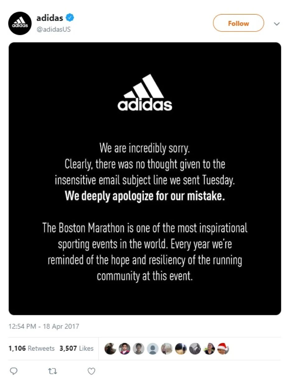
Source: https://twitter.com/adidasUS/status/854422872944771073/photo/1
Something that’s both good and possibly bad about mobile email campaigns is that they can reach people all over the world in a matter of seconds. That’s why you must be extremely careful to consider the possible ramifications of the words or phrases used, even if that means thinking about the consequences of common expressions.
For example, people often say they survived a tough day at work, a drama-filled dinner with relatives or a marathon. Given what happened at the Boston Marathon in 2013, people were not ready to associate survival with the event — since some people there didn’t live through it.
3. Using Large Image Files
Emails packed with large image files may look beautiful on a desktop, but they can cause major issues when viewed on mobile devices. Large images can slow down load times, consume significant amounts of data, and may not even display properly on some phones. If your email takes too long to load, many users will simply close it and move on.
How to Avoid It: Optimize your images by compressing them without sacrificing quality. Use image formats such as JPEG and PNG, and aim to keep image file sizes below 1MB. Additionally, include “alt text” for images so that if the image fails to load, your audience can still understand the message you’re trying to convey.
4. Subject Lines That Are Too Long or Overly Specific
People may receive dozens or even hundreds of emails each day. If someone gets an email and immediately thinks, “That doesn’t apply to me at all,” they’ll likely get frustrated with the sender for cluttering up their inboxes. Sometimes, long or overly broad subject lines also get flagged as spam by email providers.
The subject line above is an email sent to someone who signed up to earn money by carrying out secret shopper assignments at local businesses. However, the requirements for qualified individuals are overly specific here—at least for a subject line. Participants must be within the given age range and be taking a trip to Arizona soon. Additionally, on a mobile device, the subject line got cut off after “Help us.”
That means readers don’t learn about the type of secret shopping opportunity or how they could make more money by doing up to 12 daily assignments from the subject line alone. This email went to the spam folder even though the recipient also signed up for the mailing list. It’s difficult to say why that happened, but it could be that the two sentences in a row with exclamation points made the message seem like junk.
You can avoid this mistake by making the subject line brief and enticing. Choose words to capture attention, and don’t become so long-winded that people don’t see most of the subject line in their email programs.
Also, consider using segmentation to help people receive emails that apply to them. Returning to the screenshot example, a better approach would be to ask people how old they are when they sign up to receive messages from the company. Then, when the sender must recruit people of a certain age, they could use segmentation to send messages only to people who fall within the desired group.
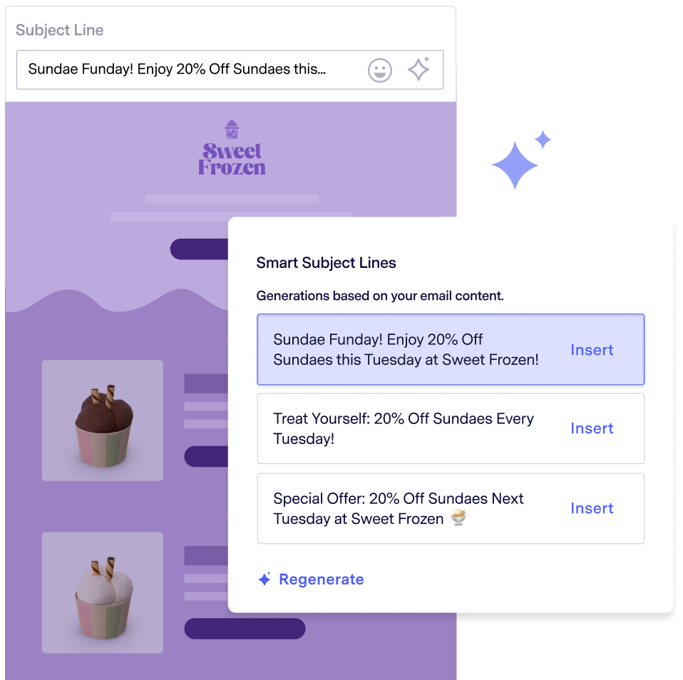
Smart Subject Lines generates engaging email subject lines every time.
5. Too Much Data Without Supporting Visualizations
Adding statistics to your emails can be an excellent way to position yourself as an authority or thought leader. However, readability is one of the hallmarks of a fantastic mobile email. Remember, people using smartphones or tablets digest the content on screens substantially smaller than what computers have. If they see huge chunks of text in an email, recipients will likely click out of it.
However, data visualizations can make statistics easier on the eyes. In the business world, they support company leaders in making more confident conclusions about how to run their enterprises. Statistics show that 77% of organizations using data visualizations noticed improved decision-making.
Visualizations apply to email marketing, too. If you’re thinking about sending a data-heavy email, you might improve it by:
- Inserting an infographic that pulls the key points from a larger study
- Creating a pie chart that shows the top benefits people get from a product you sell based on a poll
- Including a line graph that illustrates the shifts in a trend over time
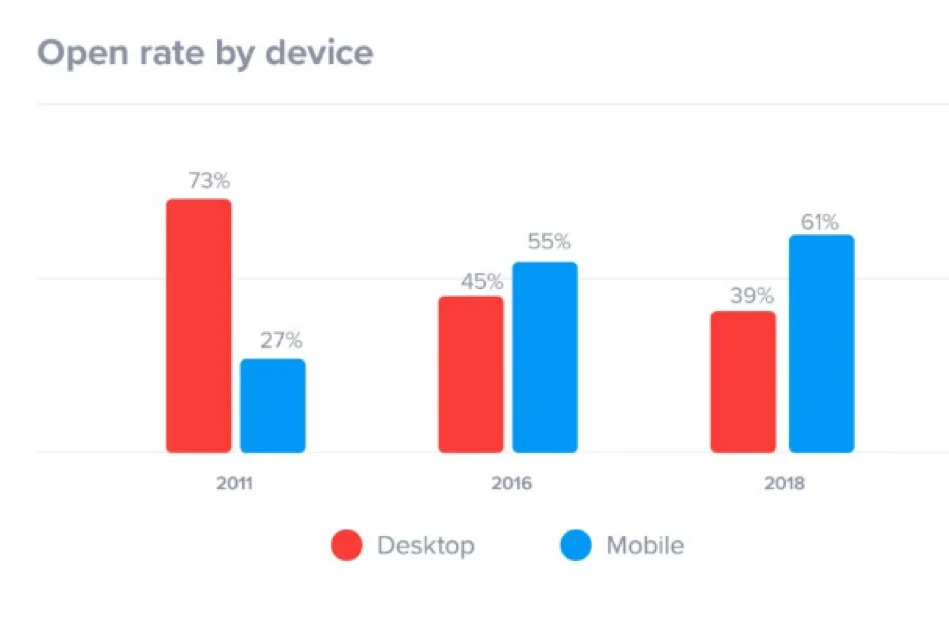
Another worthwhile method for email is making a bar graph and using contrasting colors. Check out this example of a visualization that backs up the earlier information about how more people use mobile devices than desktops. It shows the email open rates for people on mobile or desktop platforms.
Source: https://www.superoffice.com/blog/email-open-rates/
The company put this image in a blog post rather than an email, but you can immediately notice the eye-popping effects of selecting a red-and-blue color scheme. Visualizations make data easier to understand in most cases. However, for mobile specifically, long paragraphs full of statistics could overwhelm people as they read their emails.
Think about using visualizations in an email to give a teaser of more available content. For example, you might provide a chart or two, followed by a link where people can download the full research paper containing the statistics cited in the email.
6. Small, Difficult-to-Tap Buttons and Links
Another common mistake in mobile-friendly email campaigns is using small call-to-action buttons or links that are difficult to tap. Small text links or buttons may be easy to click on a desktop, but on a smartphone, they can be frustrating to use. If a recipient has to pinch, zoom, or repeatedly tap to access your link, they’re less likely to complete the desired action.
How to Avoid It: Make your CTA buttons large and easy to tap, ensuring there’s enough space around them for users to click without difficulty. A good rule of thumb is to make buttons at least 44×44 pixels, as Apple’s design guidelines recommend. Use high-contrast colors to make the buttons stand out, and place them prominently within your email.
7. Using Clickbait Headlines
Clickbait is headline content intended to get people’s attention enough that they open the content and read further. Here are some examples of typical clickbait phrases and structures:
- This one food helped her lose 10 pounds in a month
- You’ll never believe how much he saved on airfare with this trick
- The tax secret that led to a giant refund
- This common ingredient could help you fight diabetes
- The gadget that has everyone in the country talking
- Fight aging with this mind-blowing ancient remedy
Clickbait headlines are familiar sights around the internet, but research shows they could decrease your email open rates. Using “shocking” and “secret of” in subject lines made people less likely to open them.
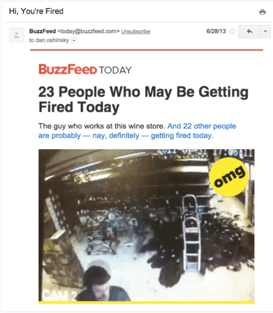
It’s also easier than you may think to emphasize shock value so much that it makes recipients feel frightened and then angry. See the email message below that BuzzFeed used to drive traffic to an article about people making mistakes on the job.
Source: https://zapier.com/learn/email-marketing/email-marketing-mistakes/
The “Hi, You’re Fired” subject line is enough to make anyone’s stomach lurch with sudden dread. The BuzzFeed representative responsible for it confirmed that the message was one of the most-opened emails BuzzFeed had ever sent. However, it’s not difficult to see how using such a fear-inducing subject line could upset people. They may even conclude that BuzzFeed betrayed their trust.
Since distributing that email, BuzzFeed established a policy that focused on delighting readers first and foremost. It’s best to steer clear of clickbait altogether in your mobile marketing campaigns. People are now so accustomed to it that it makes them weary. Moreover, the research above suggests it could make people less likely to open emails.
If you do choose to use it, never use a strategy that makes you seem callous or out of touch with your users. It’s OK to use urgency when warranted, such as when promoting limited-time offers. Just don’t structure your headline to make people click out of anxiety or desperation.
8. Not Testing Across Different Devices and Email Clients
One of the most critical steps in creating a mobile-friendly email campaign is testing it across different devices and email clients. What looks great on one device might appear broken on another. Each email client—like Gmail, Yahoo Mail, and Outlook—can render HTML differently, which means your design could look perfect in one inbox but entirely off in another.
How to Avoid It: Use your ESP’s built-in testing tools or third-party tools like Litmus or Email on Acid to preview your emails on various devices and clients. Test your emails on both iOS and Android devices, as well as different screen sizes, to ensure that your design works consistently. Don’t forget to check for load times, formatting issues, and how your images and buttons render across platforms.

9. Image-Heavy Emails
Many people who receive emails on their mobile devices want to restrict the data used. Depending on their plans, using less could result in them receiving surprisingly high bills. That’s not to say you should avoid using images, but consider whether you could convey your message without them.
Until now, we’ve seen examples of what not to do. Here’s how you can create an attractive email without the images that could eat up a person’s internet data allotment.
Source: https://www.practicalecommerce.com/Email-Marketing-3-Examples-Good-and-Bad
The branded header is the primary graphic element. Plus, several characteristics help this email stand out without lots of pictures:
- The email was sent shortly before weather experts forecasted a hurricane to hit the recipient’s area.
- It had short, scannable paragraphs.
- A bulleted list breaks down the benefits of hiring Roto-Rooter.
- The Schedule Service button follows a call-to-action to encourage readers.
How could you craft an impactful email without letting large images do the talking? An approach like the one above is ideal when addressing mobile users. You tell them what they need to know without making them download pictures first.
10. Ignoring Readability and Font Size
Many marketers must consider how readable their emails are on a small screen. Fonts that look clean and readable on a desktop can appear tiny and illegible on a smartphone. If your audience has to zoom in or squint to read your email, they will likely delete it rather than engage with your content.
How to Avoid It: Choose a font size large enough to read easily on mobile. A minimum font size of 14px for body text and 22px for headings is generally a good guideline for mobile-friendly emails. Stick to simple, legible fonts like Arial, Verdana, or Helvetica, and use only a few different fonts or complex typography that could make your email difficult to read.
Making a Mobile-Friendly Email Campaign That Resonates
The mistakes mentioned here happen more often than people think, but you don’t need to make them. Use this list as a guide while creating and implementing a mobile-friendly email strategy that people will love.


